This page displays interactive dashboards of the retirement income market, based on the 2021/22 data.
The interactive dashboard covers:
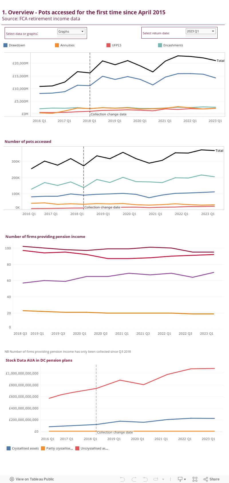
- Overview of pension pots accessed for the first time
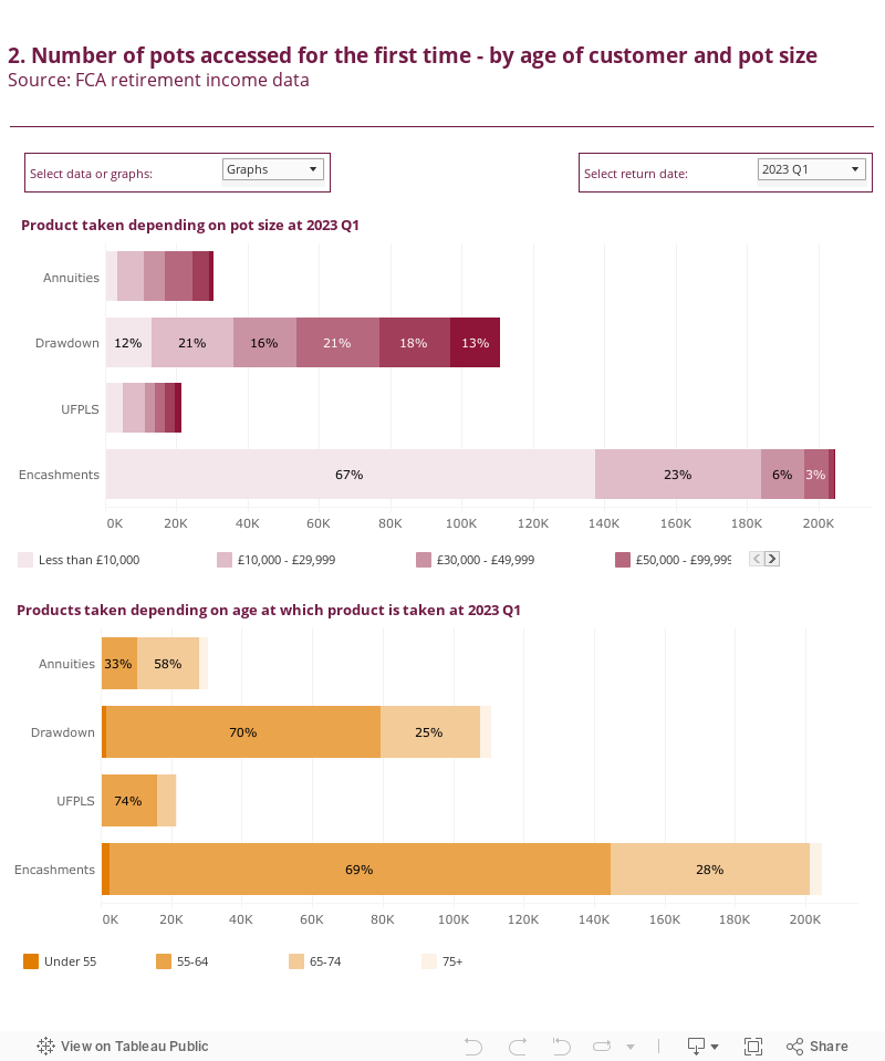
- Pension plans accessed by pot size and age
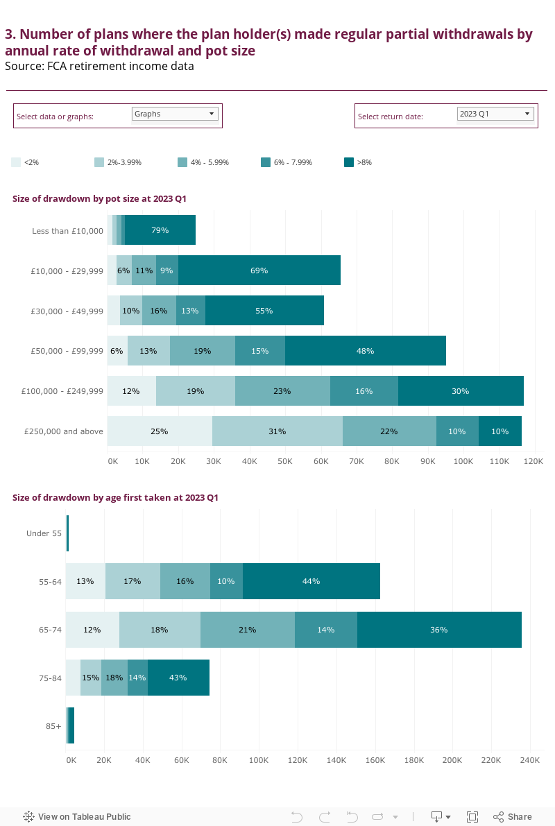
- Number of plans where the plan holder(s) made regular partial withdrawals by annual rate of withdrawal, pot size and age band
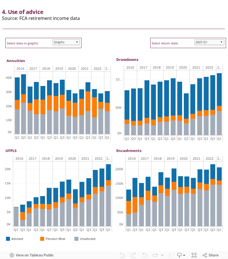
- Use of advice and Pension Wise guidance when purchasing retirement products
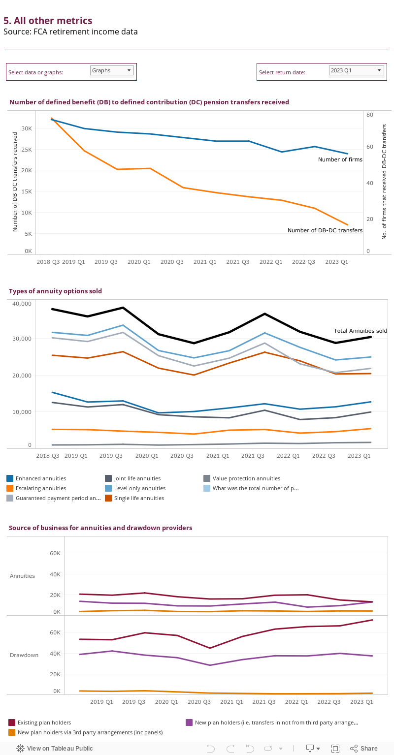
- Other metrics such as, the number of defined benefit (DB) to defined contribution (DC) pension transfers received, types of annuity options sold and sources of business for annuities and drawdown providers.
Download the underlying data for the Tableau dashboards (xlsx)
Note: Q1 covers the period from 1 October to 31 March of the year indicated, while Q3 covers the period from 1 April to 30 September.
1. Overview
Chart tip: Use the ‘Select data or graphs’ filter to toggle between the data tables or graphs, or to select the dates.
2. Pot size and age
Chart tip: Use the ‘Select data or graphs’ filter to toggle between the data tables or graphs, or to select the dates.
3. Drawdown
Chart tip: Use the ‘Select data or graphs’ filter to toggle between the data tables or graphs, or to select the dates.
4. Advice and Pension Wise guidance
Chart tip: Use the ‘Select data or graphs’ filter to toggle between the data tables or graphs, or to select the dates.
5. Other metrics
Chart tip: Use the ‘Select data or graphs’ filter to toggle between the data tables or graphs, or to select the dates.